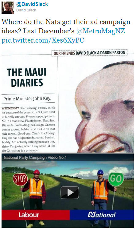
National’s initial Stop/Go TV ad is a pretty good one. Clean, to the point, not bogged down in detail but jampacked with symbolism:
Toby Manhire, writing on The Listener‘s excellent new website, has already done the analysis so I’ll quote him:
Red STOP Labour sign-guy looks a bit tense, uncomfortable, slouchily off-centre. His fist is closed, zip sloppily undone, and look at the state of those shoes.
He looks like he might just call in sick tomorrow because he feels like it, even though the country’s economy will suffer, while he just lies around, stuffing his face all day.
Green-blue GO National sign-guy looks comfortable but focused. Shoes are good. Sensible. He’s a little unshaven, but that’s because he’s a bit like the All Blacks, don’t you think? Like John Key is a bit like the All Blacks.
Check out the clouds, too. Fluffy, familiar things above Green-blue GO sign-guy; grey, foreboding, riskier bastards above that Red STOP man.
It can be no coincidence, what’s more, that the shadow GO Blue Green GO sign GO the All Blacks sign guy casts a shadow pointing where? The centre, people, the centre of the road.
But hang on a moment. The symbolism of a lazy Labourite and a clean-cut Tory is laid on a bit thick — and the scruffy old Labour guy looks just a tiny bit “ethnic”, if you know what I mean. Moreover the whole Stop/Go metaphor is a bit trite — trite enough that it was the basis for a satirical diary piece by David Slack in December last year:
And If you think about how traffic control actually works, the metaphor has coherence problems. Last night, Anna Hodge tweeted the following observation, which in hindsight seems so obvious:
Also, does National understand road works? Or fairness? You need sign-holding dudes with both GO *and* STOP to keep traffic flowing.
Um, quite. For some to go, others must stop (at least until we get reef-fish-inspired traffic management systems.)
Anna’s tweet generated a bunch of responses as the narrative of the ad began to unravel. Mine was that if you’re at the front of the queue, only the GO sign matters; others were about the size of your SUV, the increase in inequality between north- and south-bound traffic flows, and the fact that Stop and Go signs are the same sign, just viewed from different angles.
Aaron Hicks remarked that the STOP sign at road works means that there’s actually work going on, a point you’d have thought might be clear to a government undertaking such an aggressive roading policy. And did the green of the go sign hint at a National alliance with the Greens? But they’ve spent the last decade and a half telling us that the Greens’ green means stop so green is basically red, and now their own green (not even a Blue-green!) means go?
The more you think about it, the more tangled and incoherent the narrative gets. And yet for all its flaws the ad works. It relies on people not thinking too hard about it — upon audiences swallowing whole the top-level symbolic material Toby described, making what Stuart Hall called a hegemonic reading of the text. In Hall’s model the second audience position is a ‘negotiated’ reading — such as Toby’s analysis itself, which recognises the hegemonic aspects of the discourse but doesn’t necessarily accept them, and the third position is ‘contrary’; consciously reading against the text’s hegemonic meaning — what Anna did, as did those of us who responded to her observation.
A lesson from this is that reading a tightly-encoded text counter-hegemonically is hard work. Audiences are not sponges or “sheeple”; they will often take a negotiated position, but in general such a position doesn’t prevent the text from having some impact. This illustrates a point of strategy that my regular readers must be bored tears with by now: you can’t rebut a text like this head-on with wonkish facts and figures. Dry details about Labour’s record and plans on economic progress wouldn’t make a blind bit of difference to the effectiveness of this particular ad, for two reasons: first because the hegemonic material doesn’t lodge in the head, it lodges in the guts (it’s truthiness, not truth); and second because such a rebuttal implicitly accepts the framing of the original text, and that framing is half the payload. But subverting the paradigm, man, that’s where the action is.
I’m not suggesting a comprehensive strategy to counter the National party campaign could be composed around a response to one 15-second ad, but if a counter-strategy was to be composed, that’s how you’d do it. Don’t berate people for accepting the hegemonic position, or for negotiating: find ways to make them see it in a different light.
L

